Data Visualization Interactive MPG
Project Description
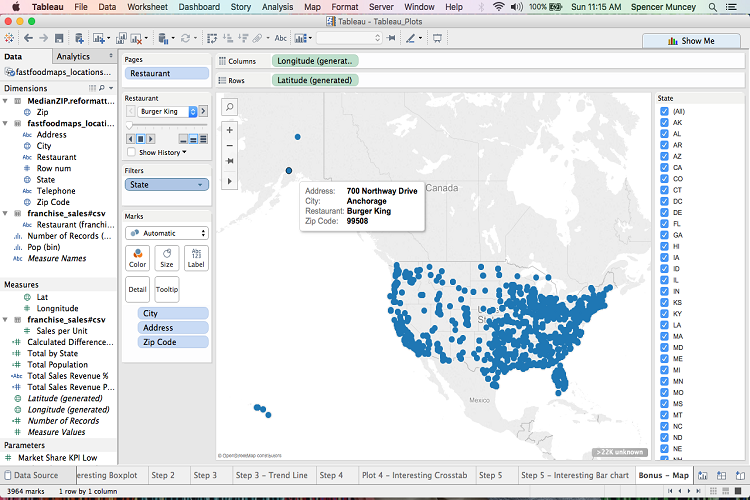
This was the fifth Data Visualization project I did for my Elements of Data Visualization computer science course. This was a more dynamic and interactive representaiton of the fourth project, which used the U.S. MPG data from the Environmental Protection Agency. This project was to take those same charts and allow more user interaction and input through the use of a Shiny® application. The only remnant of the app are the screenshots until I get the application hosted in a more permanent location. I worked collaboratively on this project with my partner,Chenchao Zhang.
Project Details
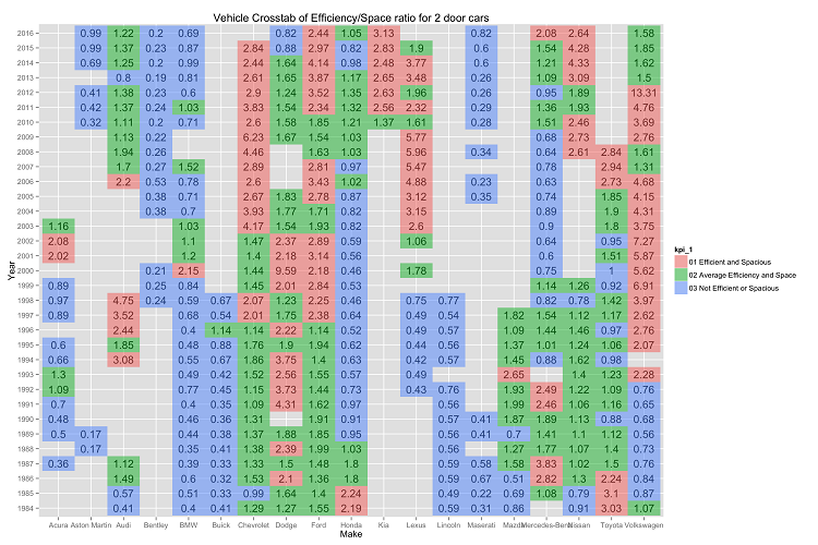
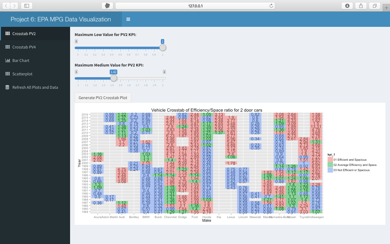
- Plot 1: KPI: MPG to Passenger Volumn Ratio for 2 door cars since 1984
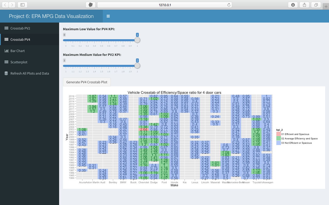
- Plot 2: KPI: MPG to Passenger Volumn Ratio fo 4 door cars since 1984
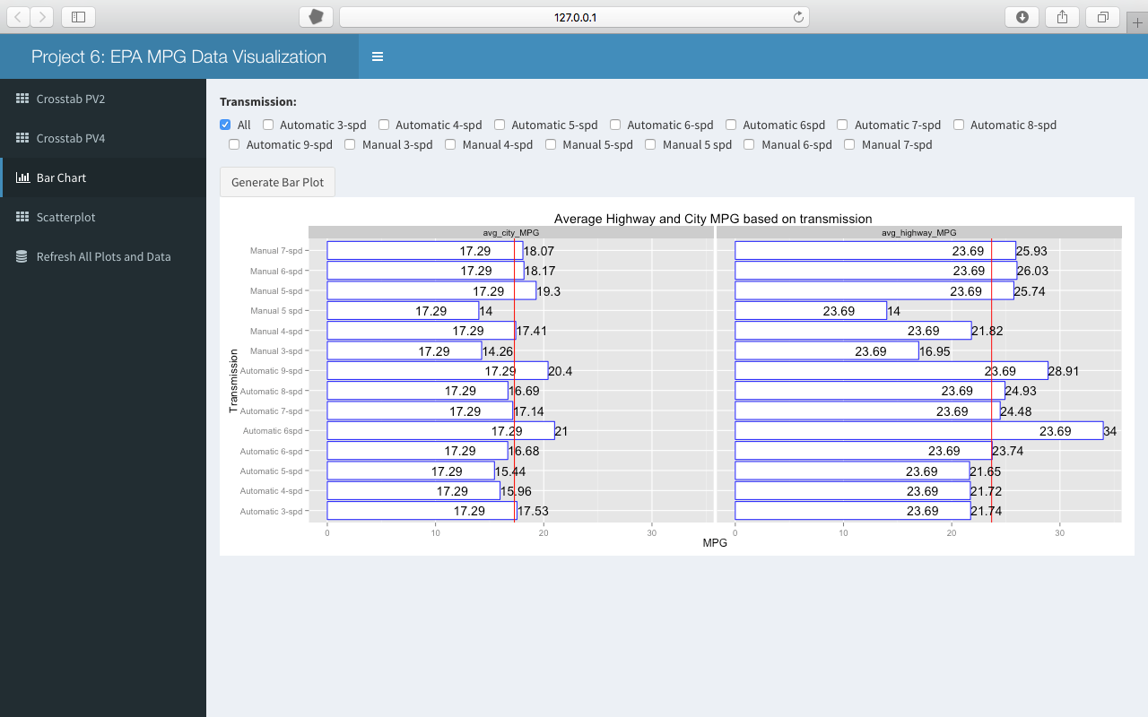
- Plot 3: Average MPG of Vehicles for each Type of Transmission
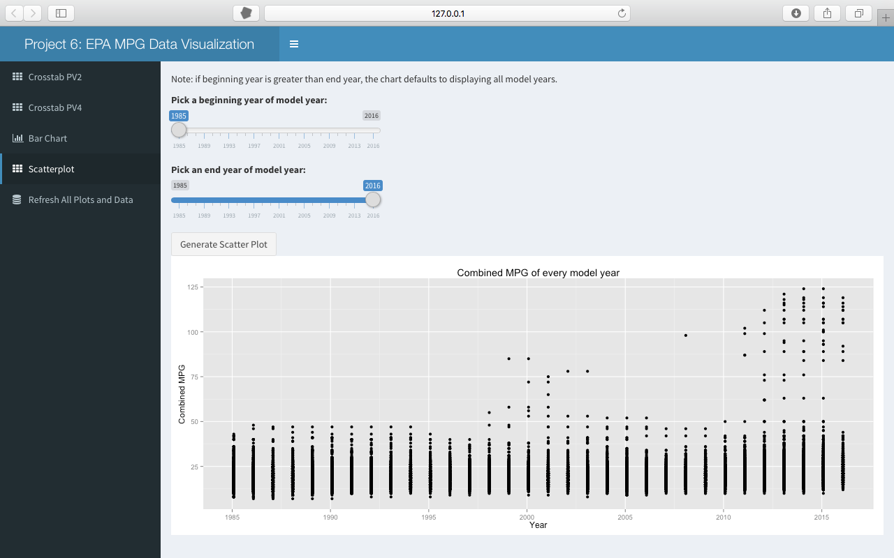
- Plot 4: Combined MPG of All Vehicles since 1984
Interesting Observations
The only interesting part (since it was a more interactive version of the fourth project) about this project was allowing the user to define what inputs and filters for the dataset. While this app doesn't reside in a central location, you can go to my GitHub account and download the app (along with RStudio and the appropriate plugins) and see it in action.