Data Visualization Fast Food & ZIP Code
Project Description
This was the third Data Visualization project I did for my Elements of Data Visualization computer science course. There are a total of 3 plots in this project. These visualizations are the result of joining two datasets on the common ZIP code field present in both. The first dataset comes from Fast Food Maps, a website created to show all restaruant locations of the top ten fast food chains in America. The data is from the summer of 2007. The second dataset comes from the University of Michigan’s Population Studies Center. The dataset originally came from the 2010 American Community Survey and the Center stripped out all of the columns except ZIP, POP, MEAN, and MEDIAN salaries. I worked collaboratively on this project with my partner, Chenchao Zhang.
Project Details
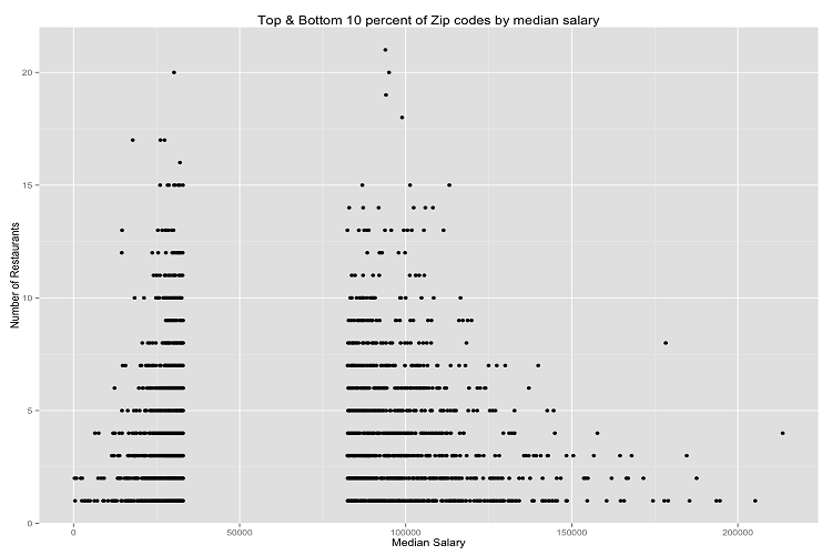
- Plot 1: Influence of a ZIP Codes Wealth on the Total Number of Fast Food Restaurants located in that ZIP Code
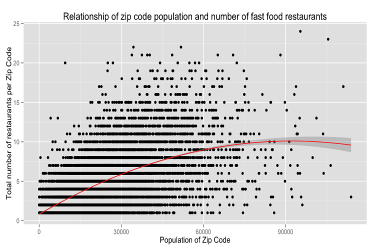
- Plot 2: Influence of Population Density on the Total Number of Fast Food Restaurants
- Plot 3: Predicting Total Number of Fast Food Restaurants using Population
Interesting Observations
Plot 1 uses median salary as a proxy for the wealth of the ZIP Code. By looking at the ZIP codes with the top and bottom 10 percent of wealth, this plot shows that ZIP Codes who have the middle 80% of wealth (median salary is between $40,000 and $80,000) also have the most total number of fast food restaurants. The second plot confirmed the hypothesis that the more people that lived in a ZIP code, the more fast food restaurants would be located in that ZIP code. The interesting part was how stark that trend was: on average, the least populated ZIP codes had slightly above one restaurant while the most populated ZIP codes had more than 10 restaurants. The last plot includes a two variable polynomial trendline to see if it was possible to predict total fast food restaurants in a ZIP code given the ZIP codes population. The trendline shows that after roughly 80,000 people live in a ZIP code, the number of fast food locations not only levels off, but the trend suggests that the number of locations actually decreases.
